Disclaimer: designing your site and picking a theme are very subjective tasks, and you’ll spend a lot of time scrolling through options that look super similar. When it comes to themes, small details matter a LOT. Finding a good theme makes a huge difference on platforms like WordPress and Tumblr, and it’s worth investing the time in finding one that does exactly what you want AND looks good. This post covers themes and design, and wraps up with some awesome examples of sites I love to visit and revisit.
First, what’s a theme?
Okay so basically your site’s theme is what creates the look and feel of your site. Things like colors, fonts, whether or not your site can adapt to different screen sizes like phones/tablets, etc. When you interact with any website on the internet, you’re interacting with that site THROUGH the theme, which is why picking a good theme is important.
How to pick a theme
This process entirely depends on what sort of platform you’re using to build your site. Depending on what you’re using to build your site, I suggest doing a quick search on YouTube for “how to pick theme on WordPress or Tumblr or <YOUR PLATFORM>” and see what comes up. Watch away and learn a bunch!
Here’s a handy video for picking wordpress themes. Adam goes through how to pick a theme, and why it might be worth paying for one. He’s not wrong. Paying can be worth it. But, if you’re cheap like me, categorically ignore anything that costs more than $0.00.
And here’s a video for tumblr. There’s no narration but you can listen to the nice music and watch along.
What to keep in mind when theme shopping
- Responsiveness – Responsiveness refers to your site’s ability to change how it looks depending on the size of the screen it’s viewed on. Very few sites on the internet are NOT responsive now that phones are a major device for surfing the web, and therefore almost all themes you’re going to pick from are going to be responsive.
- Features – Not all themes are created equally. Not all themes do the same thing. Before you pick, review the features you’ll need in your theme. For instance: are you planning on blogging a lot? You are! You’re a writer, dammit! Sorting your search by blog capabilities is a good place to start because it’ll ensure your website is savvy at handling blocks of text (like this post). Other features you might want to take into account: Accessibility, Custom headers/logos, Custom Menus, Custom control over colors. You’ll want all of these in the long run.
- Fonts – Please, for the love of your career, make sure your theme does a good and pretty job with words. Fonts matter. If any of you pick a theme that uses Papyrus or something, and I find out about it, I’m going to re-do your entire site without asking. It will be CATS THE MUSICAL themed.
- Do I have to pay? – Nope! You can, and there are some brilliant premium WordPress themes out there, but you do NOT need to pay. For instance my site’s theme is free. Will I eventually upgrade to something premium? If I need to. For now I like my theme: Shapely.
- Risks of Free Themes – The risk with free themes is that they aren’t updated by developers as much as paid themes, and that it can be heard to find information about how to manipulate theme. Before you pick a theme, search to see if there is Documentation (which is the word web developers use to refer to instructions and guidelines around how to use something). For instance, Shapely’s documentation is here.
- Testing – Most themes allow you to test them out on a dummy site set up with said theme, but you won’t know how a theme really feels until you apply it to your own site. There are better ways to test a theme than to just apply it to your site, but they’re not easy for beginners. Do what I do: make site changes in the evening, when it’s unlikely anyone’s on your site. Rough? Yes. Do we care? No. We’re building a platform; no one cares what our site looks like this early on. Take your time and get it right so you don’t have to do it again later, on the eve of your deal announcement or something.
Personalizing your site’s design
Okay, now that you’ve picked out a theme that’s competent, how are you gonna make it feel like its YOUR theme? How are you going to convey your authorial brand?
- Pictures – I’m not talking about your author photo. I’m talking about background images, header images, and featured content. Good imagery on a site makes a huge impact. For instance, my site’s imagery currently carries a fractal motif because because I’m promoing REVERIE, and that fits the book’s themes. Even my site icon incorporates this motif.
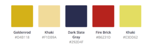
- Colors – pick a color palette, stick with it. Look at V.E. Schwab’s site — notice that there isn’t a single cool tone in sight. We have reds, blacks, and greys. Clearly the design hinges upon a coherent color palette. Unsure of what your palette should be? First, pick colors you like. If you have bad taste and these all look sort of bad together (sorry!), find a beautiful image that you feel like captures a tone or mood, and run it through Canva’s color palette generator. Record the results. Boom. You’ve got a palette. Here’s an example I ran with Sailor Venus:

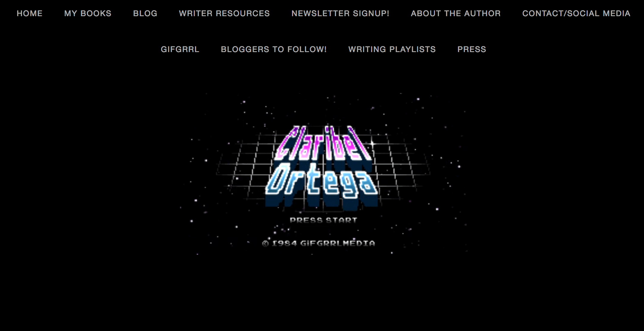
- Personality – beautiful images and colors alone do not make a site feel truly personal. Think about how it all clicks. For instance, Claribel Ortega’s site has an awesome, video game theme reminiscent of the 80s. Write or Die, Claribel’s podcast, uses very similar colors but has a different vibe. Dark, efficient, text-based, no graphics. Two sites created by the same person, showing clear personality through the colors, text, and image choices.
Author sites I like, and why
- Kat Cho — Kat worked with a designer, and it shows. That background image is gorgeous and immersive, right away.
- Brandon Taylor — Simple and elegant. Spacious.
- Candice Montgomery — I’m linking to Candice’s ABOUT page because I want to show consistency between her use of colors in both her banner image (the sunflowers) and her author photo.
- Susan Dennard – Susan’s site is super organized and light feeling despite having tons of pages and content. I particularly like her BOOKS page, for the emphasis on her beautiful covers.
- Phil Stamper – Phil is also using WordPress, but his site is super different than mine. I like that he’s put his book trailer right up front, on the homepage, followed by a link to GoodReads.
- Hafsah Faizal – Okay so this is perhaps the best author site I know of when it comes to brand, atmosphere, and overall functionality. Hafsah runs her own design company; her work is incredible, and if you’re ready to lose a few hours to gawking at her amazing sites, check out her portfolio (and consider getting in touch if you’re done with the DIY life and would like to hire her!). She knows what she’s doing. While it takes years to get THIS good, there are many lessons to be learned from her deliberate use of her logo, sprawling patterns, and color choices. Gorgeous work.
Got a site you really love? Comment below and let us know why! I’d love to add more examples!
Next post, I’ll talk about how to actually make graphics that you can use and re-use. Check out previous DIY Digital posts here.