That’s right! REVERIE now has a cover, and you can read the first chapter over at Paste Magazine, courtesy of Eric Smith! Link below. Also, you can pre-order REVERIE! It’s up on Amazon, with more options to come soon.
Exclusive Cover Reveal + Excerpt: Inception Meets The Magicians in Ryan La Sala’s Reverie
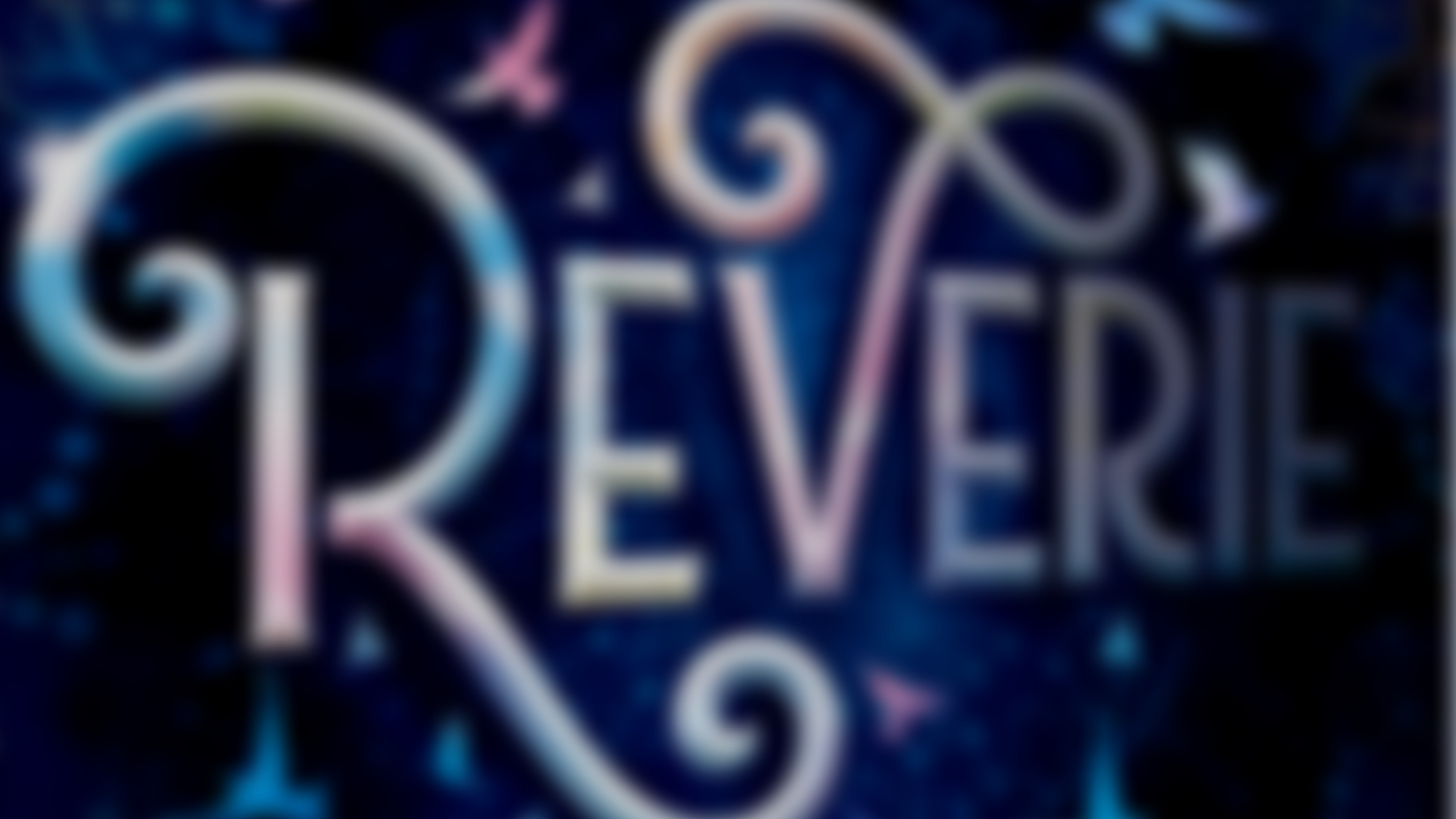
About the cover
So you’ve seen it, right?
I’m in love. The depth. The shimmering glitz. The sense of tipping through a dimension that is unraveling around you…that sense of your perspective shifting…
I love it. I cannot wait for every other book to positively WILT when put aside this beauty. I’m kidding. I know it’s not like that, and I’m not that conceited. But I AM excited that REVERIE’s cover literally shines. If anything shall wither next to it, it’s going to be me. My face. I can’t compare to this! I don’t even sparkle a LITTLE bit.
Anyhow, let’s talk about the design:
It’s no secret that REVERIE covers….a lot of territory. There were many, MANY directions we could have gone in with the cover, some more obvious than others. This is why I am SO grateful for the team at Sourcebooks, and especially Nicole Hower (the incredible Art Director behind some of the most iconic covers out there) and Leo Nickolls (the hyper-talented artist).
For this cover, we wanted to capture an ethereal, unraveling magic within a sense of warping perspective. We wanted something that was bold, without feeling overly stark. We wanted something with depth, without feeling overly subtle.
Nicole and the Sourcebooks team did all these dreams justice, and then some. For instance I never dreamed my book would have…iridescent foil. Like. WHAT? Isn’t that illegal?
But let’s talk about rainbow foil, okay? REVERIE’s content is in dialogue with a lot of queer themes, and it was important to me that there be a visual indicator of this on the cover. But I wanted to approach this with SOME subtly. I’m acutely aware that the content of my book–specifically it’s unabashed centering of queerness–creates a risk for some readers. Readers who are reading in environments that carefully watch for flamboyance or eccentricity.
Those are the kids I think of most when I’m writing, so I wanted a design that evoked the mysterious power of many queer symbols: clear to queers, sparkly to everyone else. And that’s what this design is to me. It’s the right balance between conspicuous queerness and canon fantasy whimsy, and I dig the range.
Eventually, when the book is out, I’ll do a deeper dive into the symbolism of a few things in the design, but for now I hope you read the chapter and love it!